Let's keep in touch!
© 2025 Khateallen. Fueled by lots of matcha 🍵 All rights reserved.
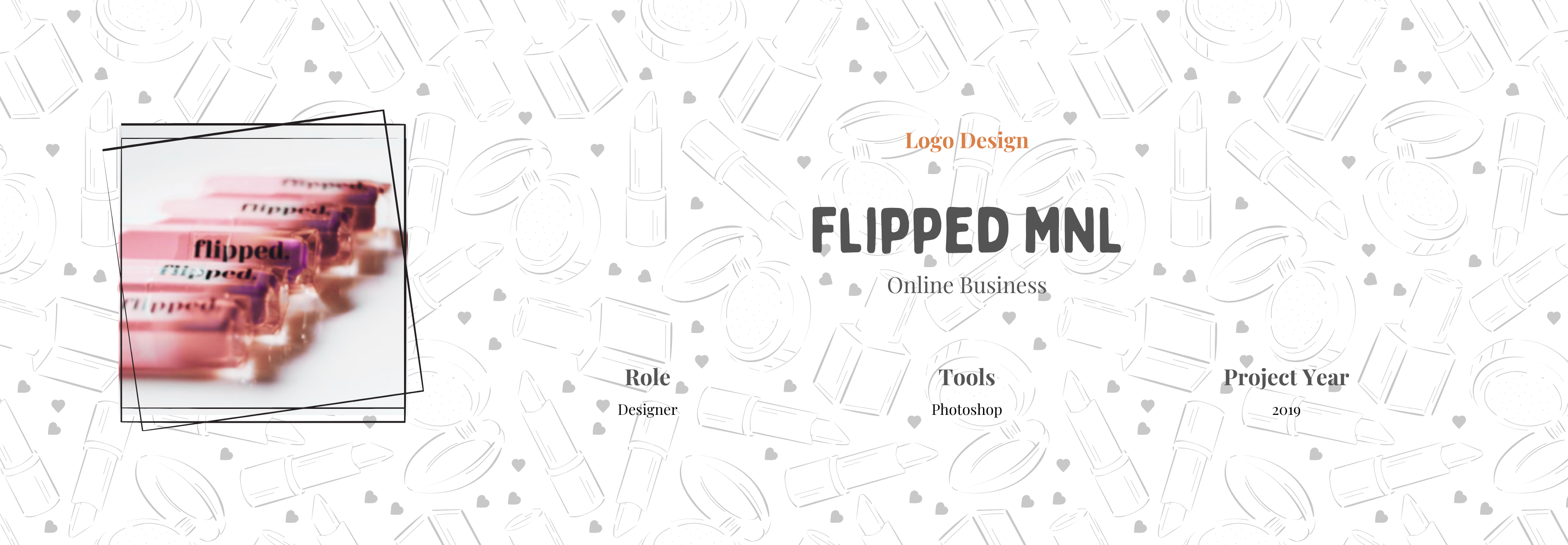
Flipped Manila is a local lipstick brand aiming to blend minimalism with elegance. The goal was to create a visual identity that felt refined yet approachable—something that could appeal to both premium and everyday markets in the Philippines. The client specifically requested a clean and minimalistic logo that would reflect the simplicity and sophistication of the brand. I worked closely with her to develop a visual identity that became the foundation of the brand’s packaging and public presence.

The name “Flipped” hints at transformation and bold self-expression, so the brand identity needed to feel both modern and versatile. Inspired by sleek beauty brands and timeless design aesthetics, the logo leans into minimalism to communicate confidence, quality, and clarity—without unnecessary frills. It’s a statement of simplicity that stands out.
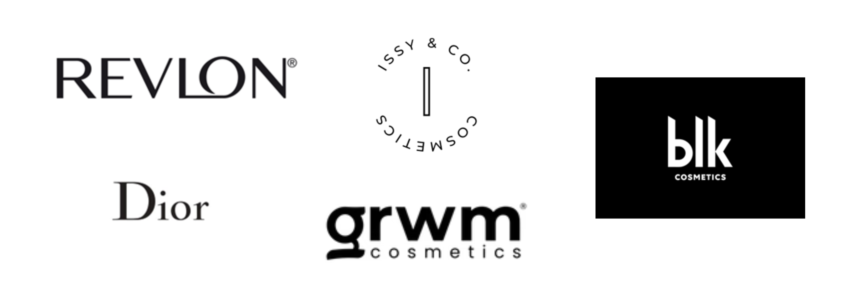
The client provided a moodboard filled with logos from both high-end and local cosmetic brands in the Philippines. This gave me a clear sense of the style she was drawn to—clean, minimal, and modern. Using the moodboard as a guide, I made sure the logo design would feel fresh and recognizable, but still familiar to the local beauty market.
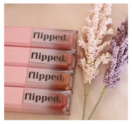
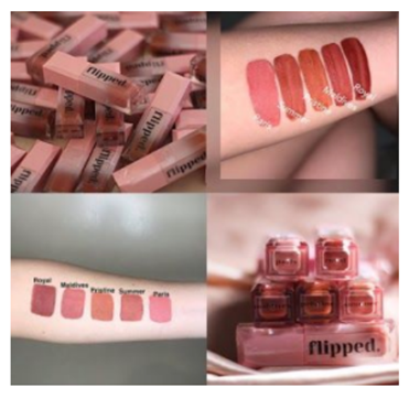
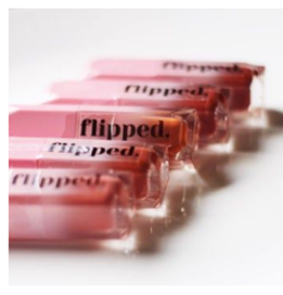
This project focused on logo development and product application. I provided multiple logo options based on the research and moodboard we built around beauty branding. Once the final logo was chosen, it was applied directly to the lipstick packaging.
I created four initial logo options based on the client’s preferences. Each option followed a clean and minimal style, with variations in layout, typeface, and composition.

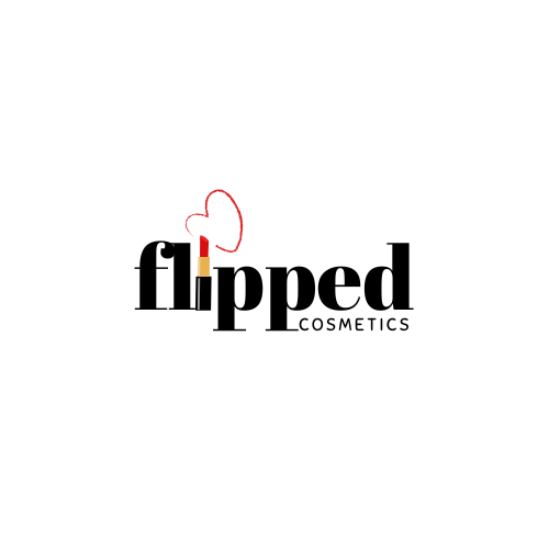


The selected logo was simple, bold, and modern—exactly what the client envisioned. It was designed to look elegant on packaging and digital platforms.

The final logo was applied to the lipstick packaging, showcasing how the identity works in real-life context.
This project was one of my earlier branding experiences and taught me a lot about how to make minimalism feel impactful. I learned how to build trust with a client who had a clear vision, and I saw how strong design can quickly transition from concept to production. It reinforced the value of simplicity in creating a lasting brand.