Let's keep in touch!
© 2025 Khateallen. Fueled by lots of matcha 🍵 All rights reserved.
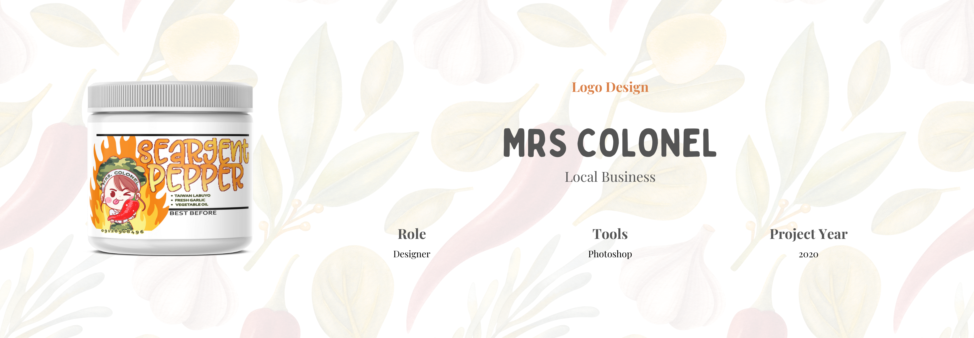
Mrs. Colonel is a small, family-run chili garlic business that wanted a standout logo for their homemade product. With full creative freedom, I was able to explore lighthearted and memorable design directions. The final outcome featured a playful, illustrated logo that helped the brand feel approachable, unique, and personal to the owner—instantly making it more recognizable in local markets.


To bring the brand’s homemade charm to life, we leaned into a warm, nostalgic style inspired by the Cooking Mama game. The main logo featured a chibi-style character based on the client herself, representing both the product and the maker behind it. This character approach added personality and allowed us to visually express the different chili garlic spice levels in a way that was fun, relatable, and easy to remember.
This project was all about having fun with the design while still making sure everything felt clear and cohesive. I created several logo options for the client to choose from—each one showing a different take on the chibi-style character and spice level ideas. Once the final logo was selected, I helped apply it to the product packaging, making sure it popped and felt true to the brand’s playful identity. The result was something eye-catching and full of personality—just like the product itself.
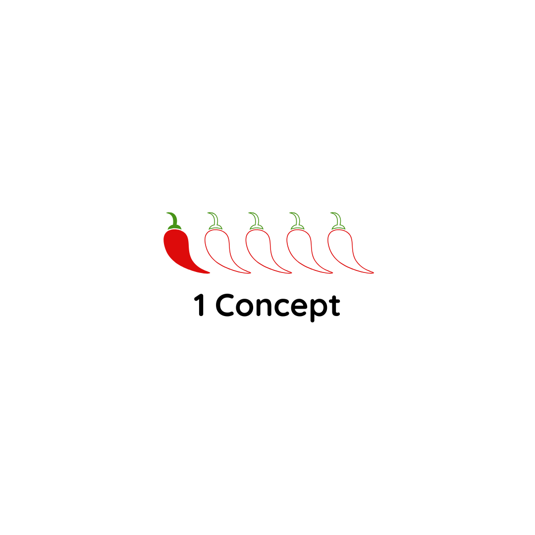
I presented a set of logo options featuring different chibi characters, each representing a variant of the chili garlic with varying spice intensities and expressions.


The chosen logo featured a chibi-style illustration of the owner, paired with hand-drawn type, reflecting the product’s playful yet personal branding.
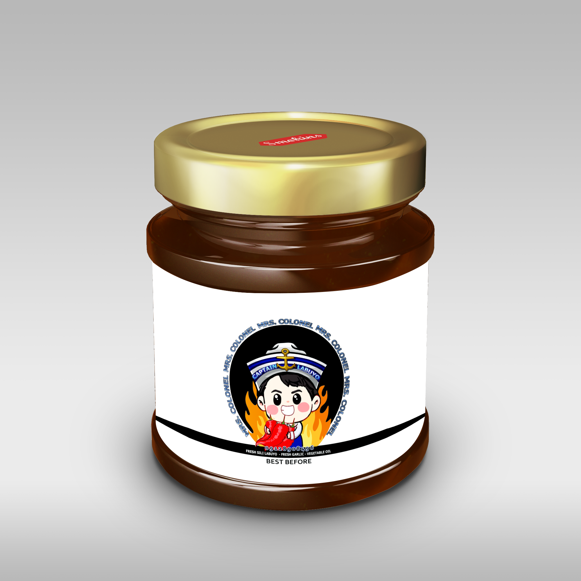
To bring the logo to life, I created mockups that show how it could look on jars. These mockups helped the client visualize how the design would work in the real world and made the brand feel more complete, even before full production.
.png)
.png)
.png)
Working on this project reminded me how much creative freedom can elevate a simple idea. I loved the process of turning flavor into personality, and it was a joy working with a small business owner who trusted my direction from start to finish.