Let's keep in touch!
© 2025 Khateallen. Fueled by lots of matcha 🍵 All rights reserved.
Uniplay is an organization focused on making learning fun, inclusive, and accessible. This branding project was all about creating a visual identity that felt both playful and professional—something that could appeal to kids, parents, and educators alike. As one of the designers on the team, I helped shape a brand that looked vibrant and futuristic while staying grounded in purpose and clarity.
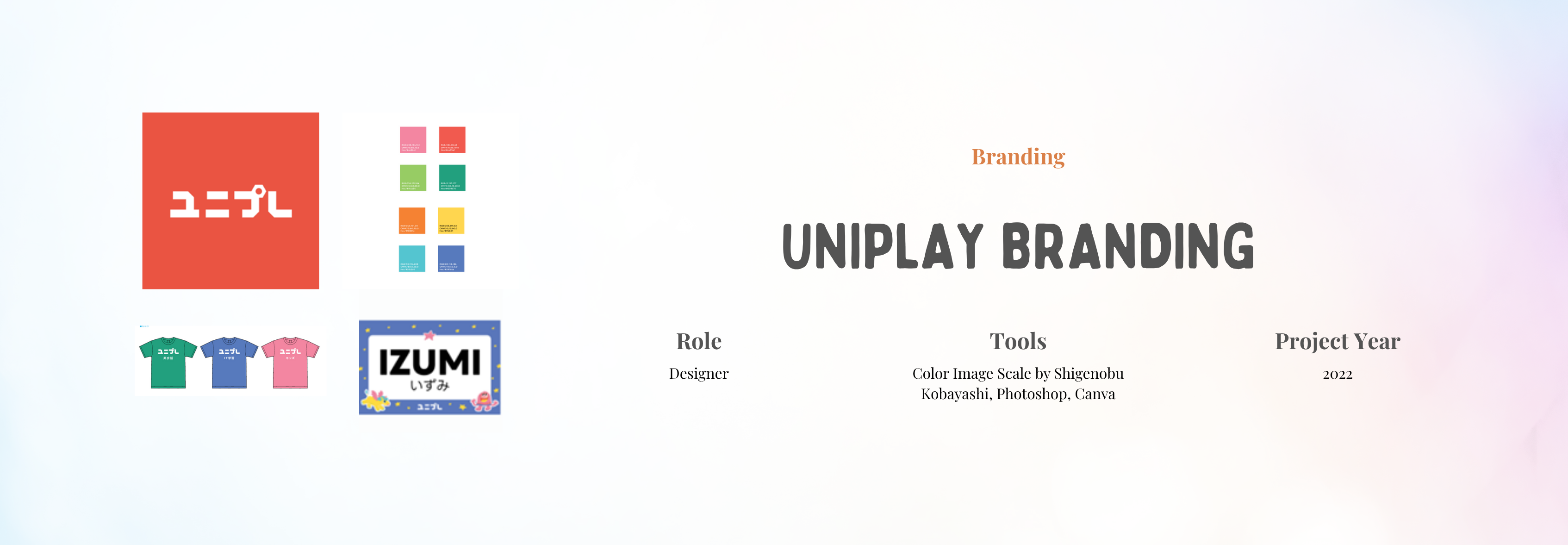
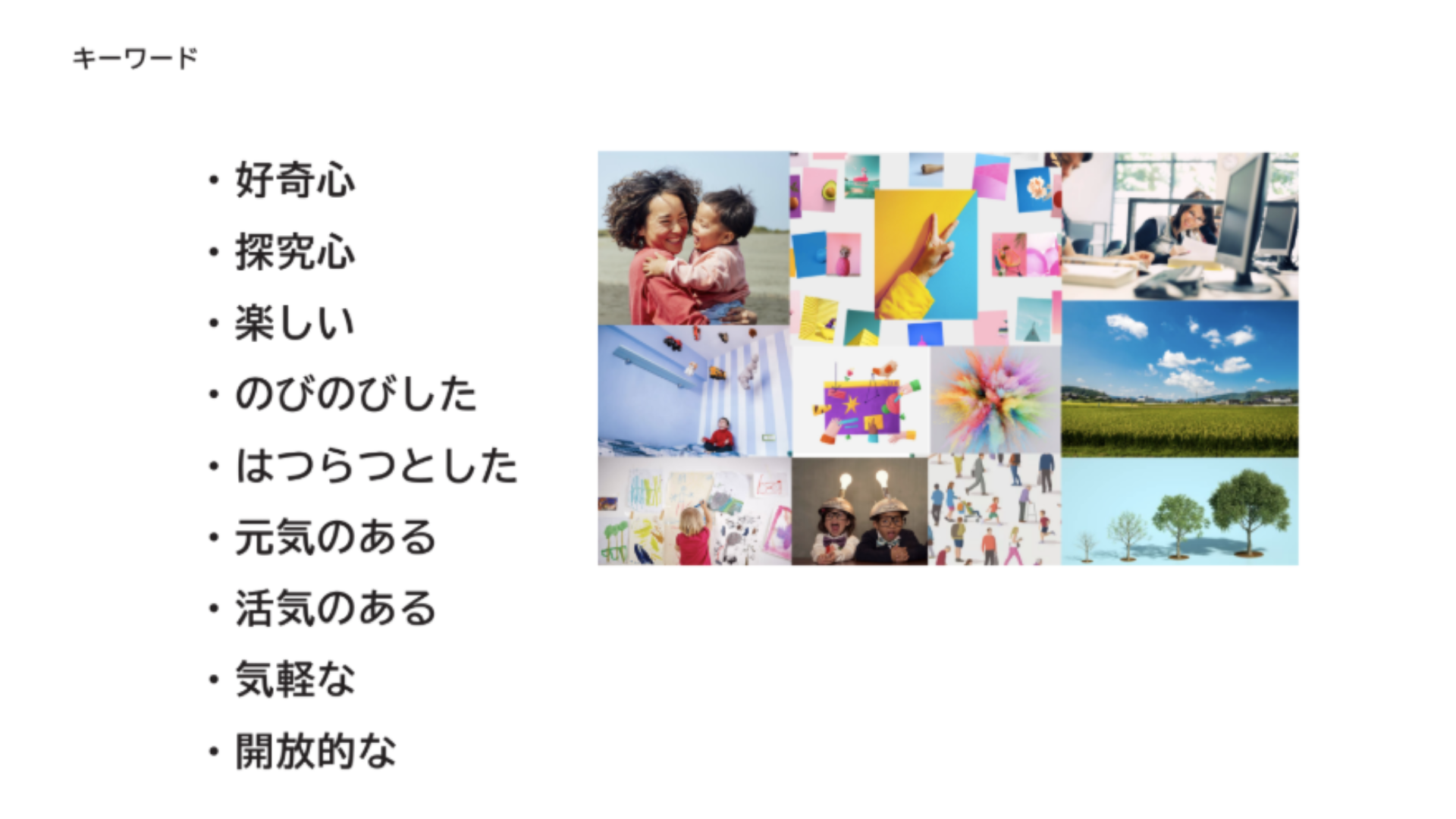
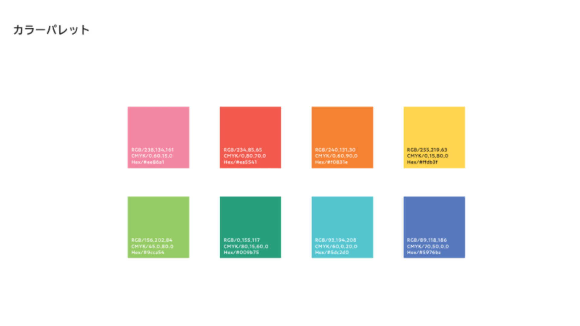
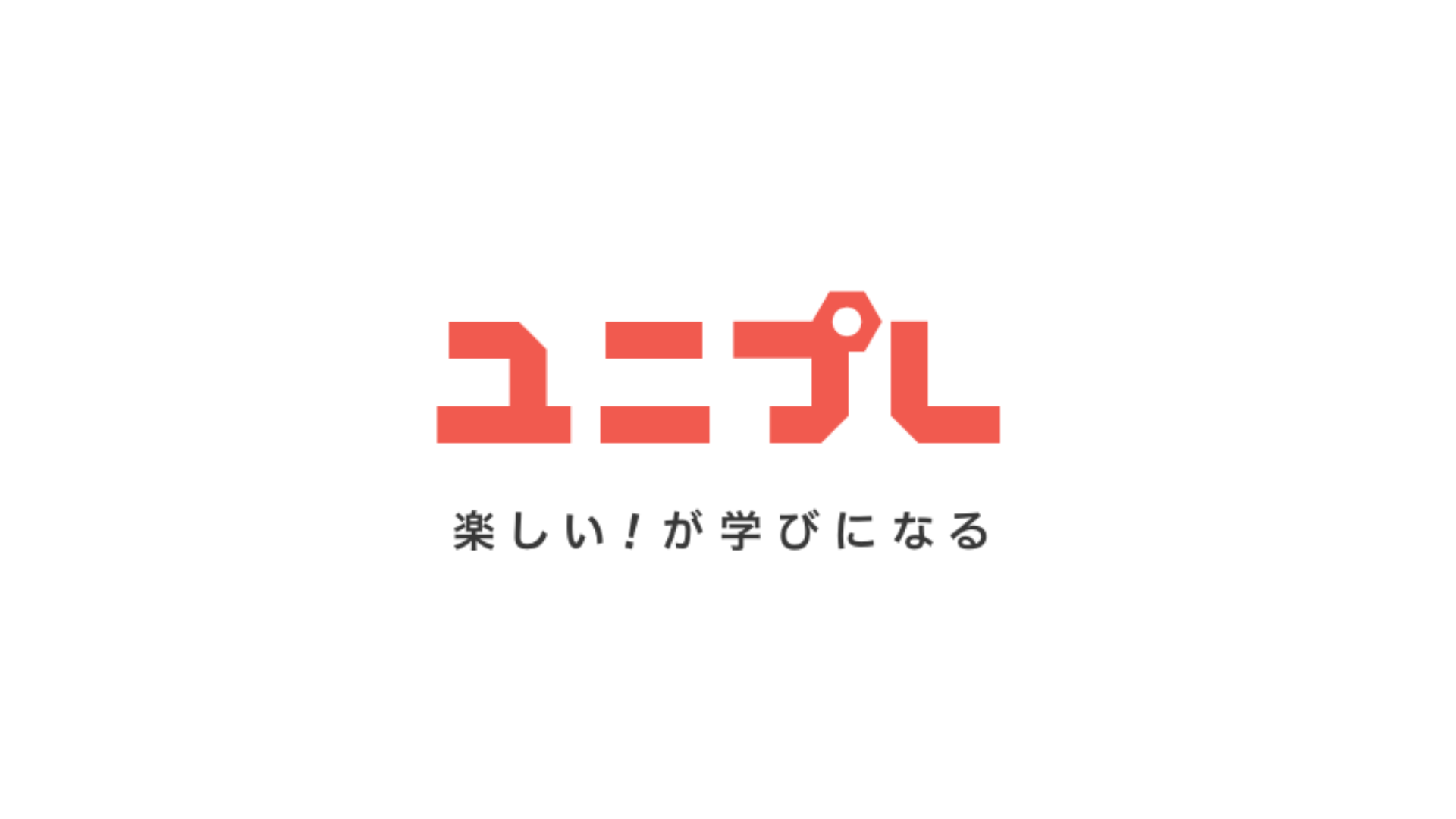
Our goal was to bring the Uniplay mission to life visually. During team discussions, we aligned on key ideas like curiosity, joy, and openness. Inspired by these values, the brand design leaned into playful shapes, dynamic layouts, and bold colors. The main logo featured a hexagon, symbolizing both strength and longevity—pulling from Kokura’s steel heritage and the form of a turtle shell. The red logo color added a bold, gender-neutral touch, supported by a wide color palette to represent diversity. We also crafted the catchphrase “Fun! is Learning” to tie everything together in a friendly and energetic tone.
As part of the design team, I contributed to the creation and refinement of these core materials:
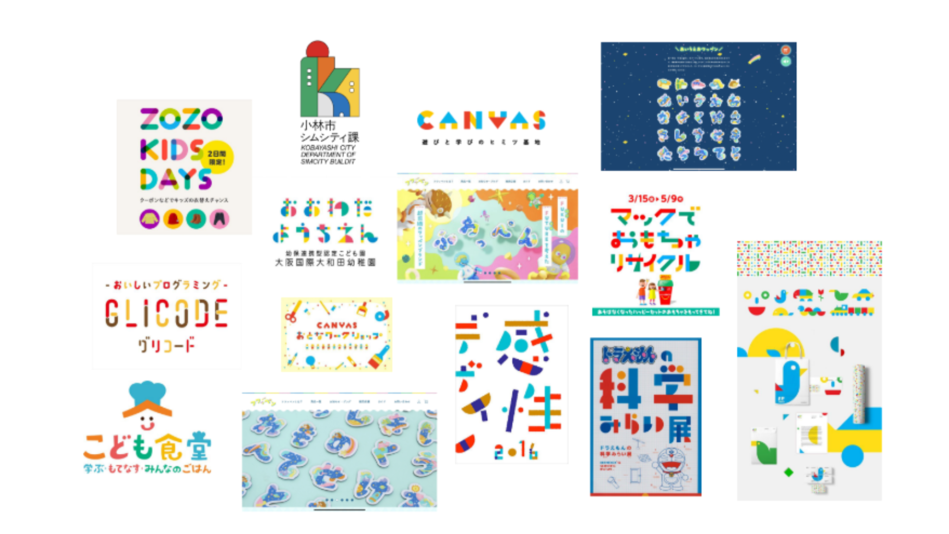
These helped set the visual tone of the project and guided the overall design direction. While I didn’t lead this part, it was a crucial reference throughout the process.
A hexagonal logo paired with a modern typeface and a vibrant palette, designed to be memorable and flexible across mediums.

The final red logo became the main mark for the brand, setting the tone for the rest of the identity.

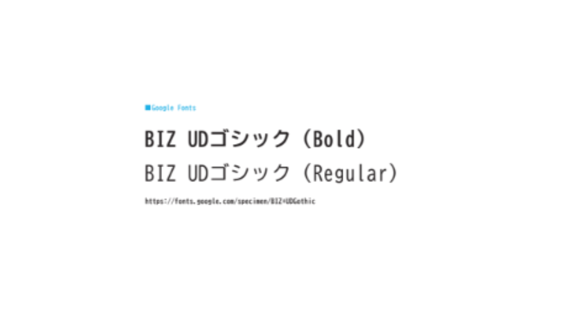
We used Shigenobu Kobayashi’s color image scale to guide the palette, ensuring the brand felt lively but coherent. The chosen font, BIZ UD Gothic, ensured accessibility across age groups and formats.

The phrase “Fun! is Learning” encapsulated Uniplay’s mission and guided the visual tone we applied across the branding.

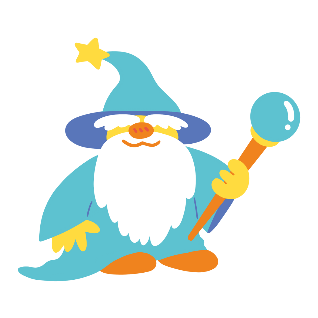
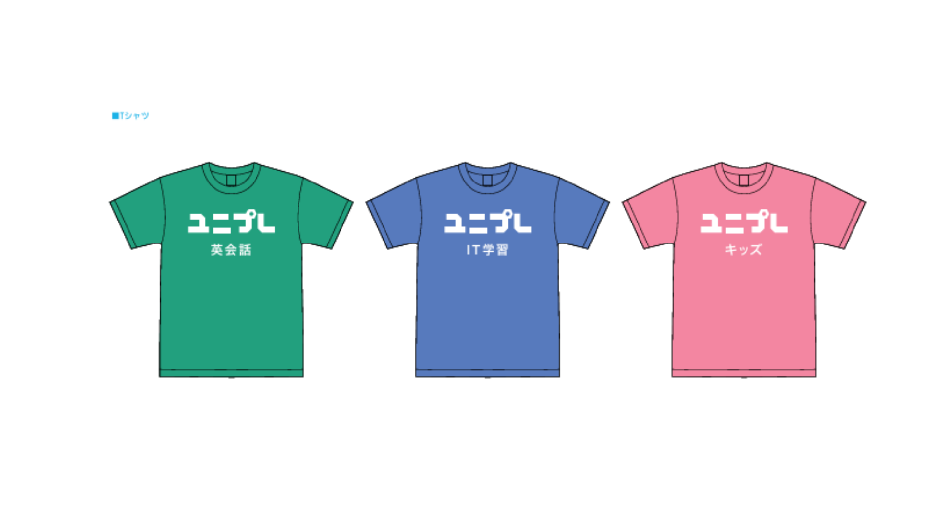
We designed name tags, T-shirts, and other branded materials. To bring more personality to the brand, we incorporated original character illustrations and playful graphic elements created by one of our teammates. These gave the materials a distinct look and helped connect with younger audiences.

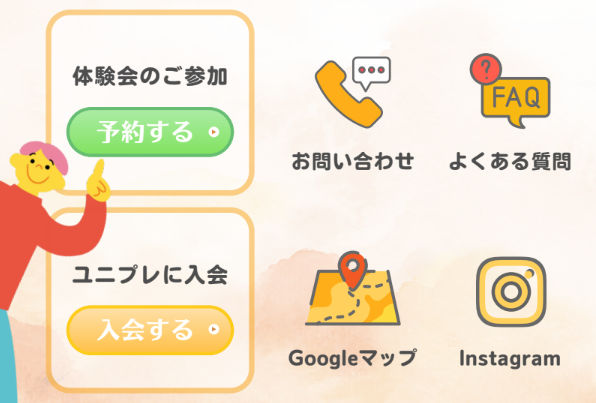
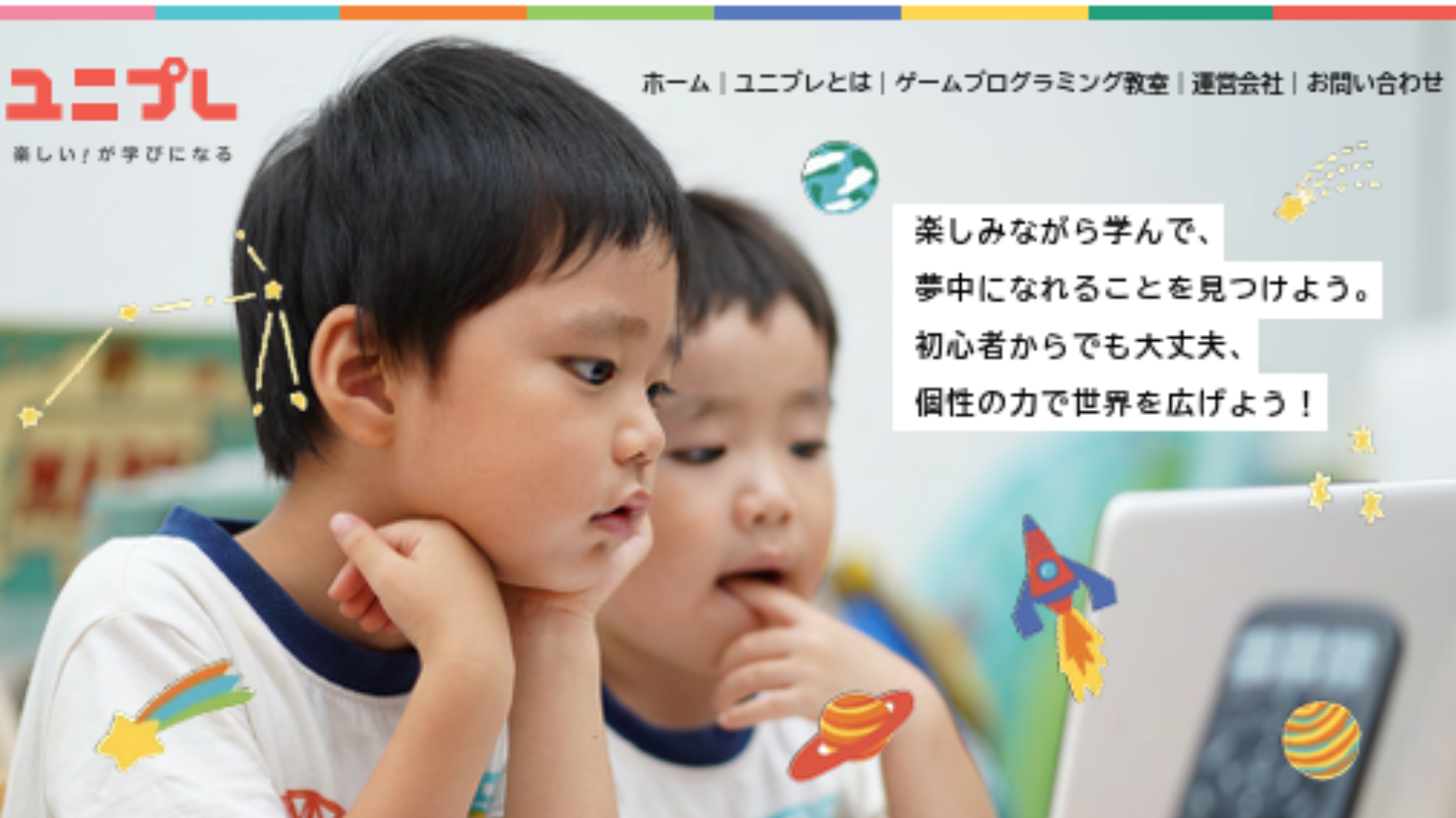
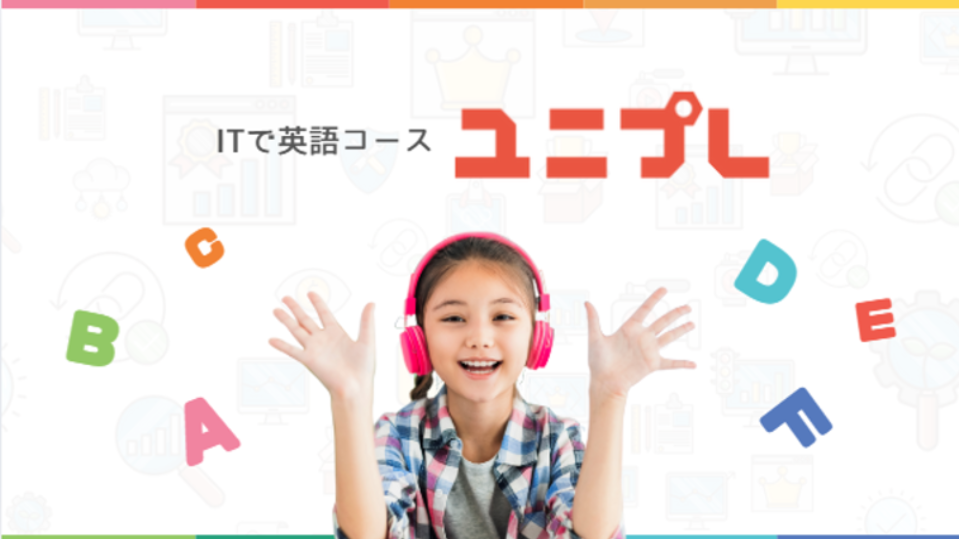
We designed website layouts that were clean, accessible, and colorful—bringing the brand's energy online while making information easy to navigate for both kids and adults.
This project was a great opportunity to collaborate closely with a creative team and explore how design can make education more engaging. I learned a lot about building systems that work across sub-brands, how to incorporate meaningful symbolism, and how color theory can be used intentionally to express brand values. It was a challenge to strike the right balance between playful and professional, but the final outcome felt like a true reflection of Uniplay’s vision.