Let's keep in touch!
© 2025 Khateallen. Fueled by lots of matcha 🍵 All rights reserved.
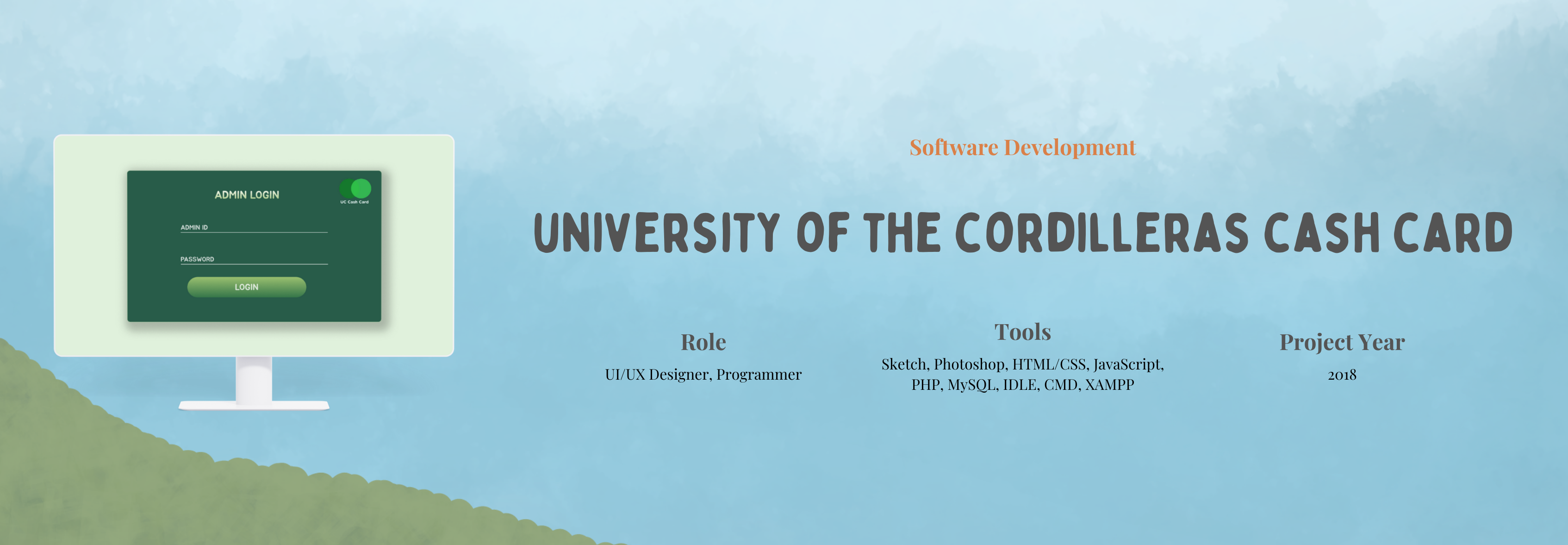
The UC Cash Card is a campus-based cashless payment system that turns student ID cards into reloadable cash cards. Developed with fellow students from various IT tracks (ERP, Web, Network Security), the goal was to make payments faster, safer, and more convenient across the campus—from the cafeteria to the bookstore.


Students and faculty experienced daily challenges using cash for purchases at the cafeteria, bookstore, and other campus services. Long queues during peak hours, the inconvenience of loose change, and the absence of a transaction tracking system led to inefficiencies and frustration across the board.
The UC Cash Card system allowed users to use their student ID for secure tap-to-pay transactions. Students could reload their cards via the cashier and view their balance and transaction history through a digital dashboard. Faculty and staff were provided tools to track and monitor payments more effectively, creating a unified and cashless campus experience.
To ground the project in real user needs, we conducted research and built an affinity map. This visualized common themes and frustrations from both students and faculty.Students consistently emphasized the need for quick and easy payments, while faculty wanted transparent ways to monitor expenses. Security concerns around lost cards and delays caused by limited hardware were major pain points. The affinity map helped us cluster these insights and identify design opportunities such as improving security features, increasing scanner availability, and educating users about how the system works.
.png)
The goal was to design a secure, fast, and easy-to-use cashless payment system that seamlessly integrated into existing campus services. The system had to handle high-volume usage during peak hours while making it simple for students to monitor their balances and transaction history. We also aimed to support staff in managing transactions more efficiently.

Key Features:
・Tap-to-pay system.
・Balance check & transaction history.
・Integration with campus services (cafeteria, bookstore, printing).
.png)
We started by gathering insights from students and faculty to understand their needs and pain points. Using that feedback, we mapped out the user flow and created basic wireframes to plan the layout and structure. These were later improved into mid-fidelity wireframes with more detail. We also designed a simple UI kit with clear visuals and consistent styles. Once everything was ready, we built an interactive prototype to show how the system would work, focusing on making it easy to use and efficient during busy hours on campus.
We mapped the typical user flow from registration to payment. Early sketches explored the layout of each page and how users would interact with features like reloading, checking balances, and accessing purchase history.
We started with low-fidelity wireframes to outline the system’s basic layout and flow. This helped us focus on the structure and key user actions without getting distracted by visual design too early. It gave us a clear picture of how each part of the system would connect and function.
Once the structure was in place, we moved on to mid-fidelity wireframes. These included more detailed layouts, showing button placements, form fields, and navigation elements. This stage helped us refine the user experience and prepare for a smoother transition into high-fidelity design and development.
.png)
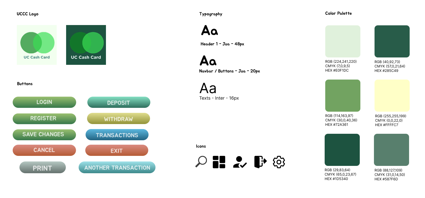
For the visual design, we kept things clean and modern to match the professional tone of VIVIXX Academy. We used the organization’s existing logo and built a UI kit with consistent colors, typography, icons, and simple illustrations to support easy navigation. The goal was to create a polished and cohesive look that made the system intuitive and visually appealing for both admins and participants.
The prototype showcased the full UC Cash Card system, including essential features like student registration, balance reloading, withdrawal, transaction tracking, and admin controls. While the tap-to-pay function was successfully implemented, available visuals highlight the system’s user interface—such as dashboards, account settings, and expense monitoring. The prototype demonstrated how both students and admins could efficiently manage their accounts, offering a clear picture of the system’s functionality and user flow.
User testing was conducted in a simulated environment using an Excel spreadsheet containing various test cases to track performance. A total of 200 students participated in testing core functions such as registration, depositing funds, checking balances, and making transactions. The data helped identify both successful interactions and areas needing improvement.
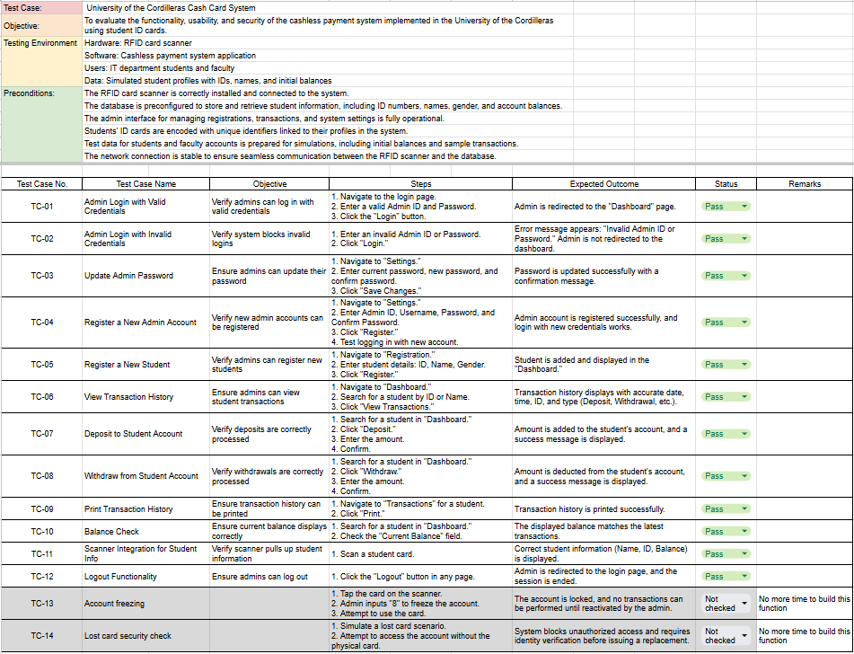
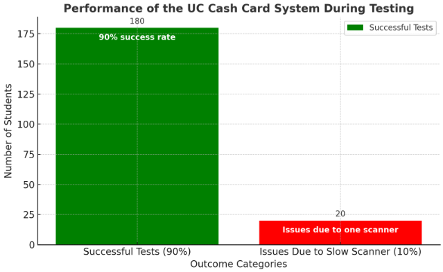
The testing of the UC Cash Card System demonstrated a 90% success rate, with 180 out of 200 students successfully completing transactions without issues. This result indicates that the core functionality of the system—such as registering, depositing, and checking balances—operates effectively under normal conditions.
However, 10% of students (20 participants) experienced delays or issues during testing. The primary cause of these problems was identified as the limited availability of only one scanner, leading to slower transaction processing during high-usage periods. This highlights the need for additional hardware to improve system scalability and ensure smooth operations.
Overall, the testing successfully validated the system's functionality and its potential to streamline cashless payments on campus, while also emphasizing areas for improvement in scalability and user experience.

This project helped me grow a lot as a designer and developer. I learned how to work better with a team, especially with people from different IT tracks. It showed me how important good communication is when building something together.I also improved my skills in designing user-friendly systems and using tools like QR codes and online dashboards. Testing the system with real users taught me how valuable feedback is—and how small changes can make a big difference.
One important lesson was thinking ahead. When some testers had issues during busy times, I realized how important it is to plan for more users in the future. Overall, this project helped me become more confident in both design and problem-solving.
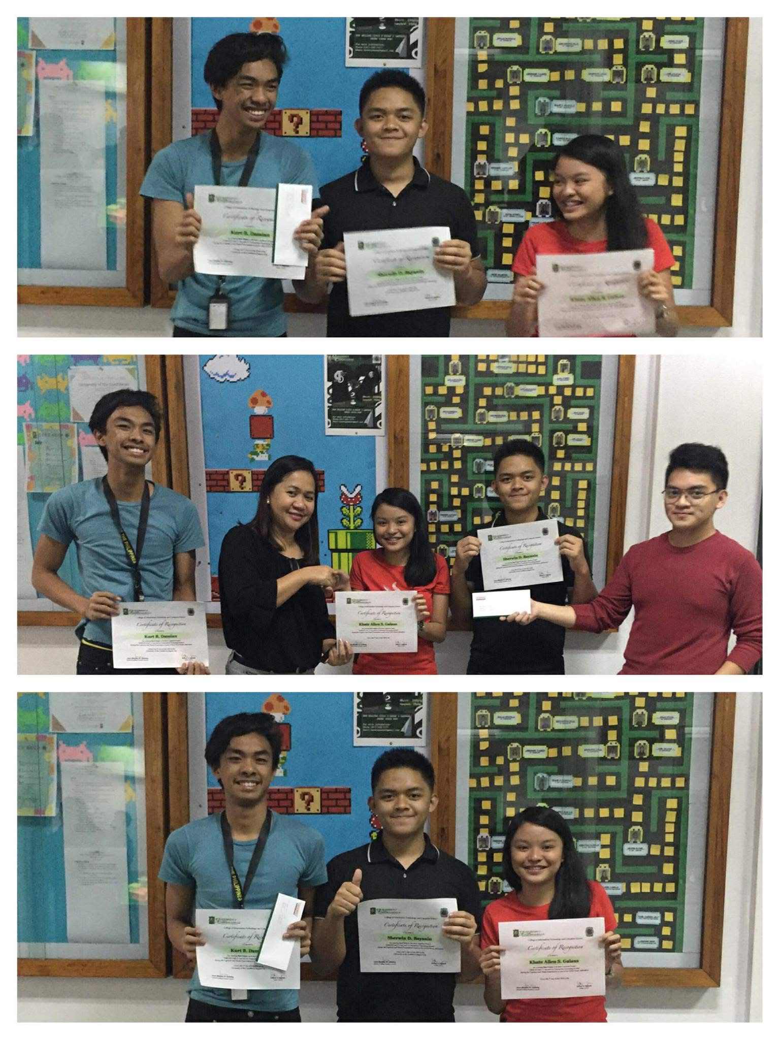
This project was awarded Best Thesis in the IT Department with a final grade of 99. It was recognized for its innovation, technical quality, and how it improved everyday transactions on campus.